From the point where you enter the gallery, it is clear that this is not your average quilt show. If you were expecting log cabins and pin-wheels you are in the wrong place.
According to Suzanne Gummow, one of the judges and organisers of the exhibition, for the purpose of this show, the definition of a quilt is that it must be predominantly fibre, be composed of at least two distinct layers, and be stitched together throughout.
That sounds simple enough until you look around and see in how many diverse ways this has been interpreted.
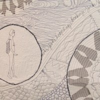
CBD Pojagi
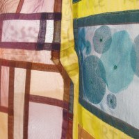
Samantha Pope’s CBD Pojagi is the star of the show. On first glance, it is obviously a map of Adelaide CBD, with familiar landmarks like Victoria Square and the green belt easily identifiable. True to the purpose of a map, it is the first thing you look at when entering as if trying to find your way around. But also true to the purpose of a map, its sheer fabric lets you see what is beyond – opening the way towards the rest of the exhibition. The fusion of what is familiar (Adelaide) with what is foreign (pojagi) embodies not only the spirit of our city but also the spirit of the exhibition – the familiarity of quilts with the unfamiliarity of the Dare to Differ interpretations.
Art in the Negative Space
Following the layout of the room, the first work you will come across is fellow judge and organiser, Julie Haddrick’s Garden path. Her use of Japanese fabric is the start of a subtle theme which recurs three more times.
Wendy Thiel’s Art in the Negative Space is one of the larger works and one of the few which reminds of a traditional quilt. Her use of white as negative space emphasising the art of the printed Japanese fabric, as well as her choice of quilt design inside the white areas, are very effective.
My Chiku Chiku
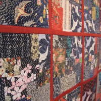
Staying with the Japanese theme, Betty Morse’s My Chiku Chiku creates quite the opposite effect. Filled to the borders with printed fabric, it dares the eyes to become overwhelmed, but the order and stillness of the sashiko stitching are calming on the eyes and restores order. Her work is inspired by renowned sashiko artist Akiko Ike.
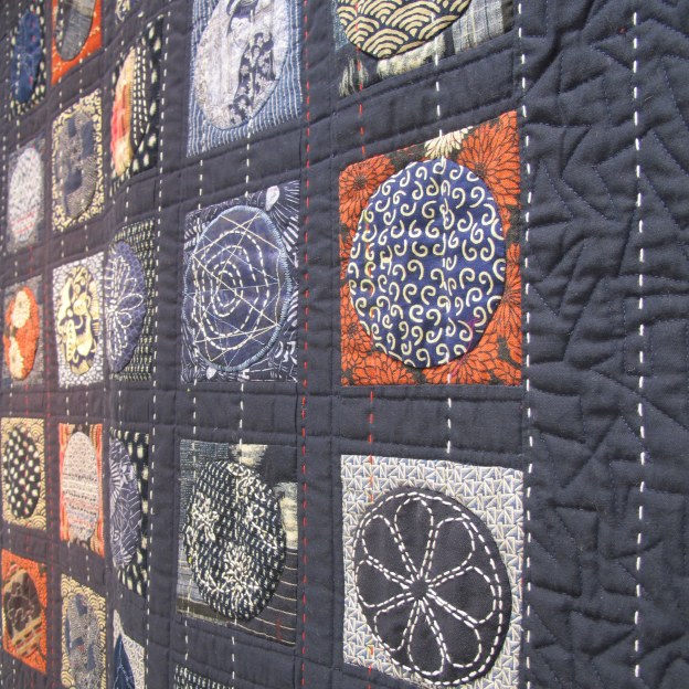
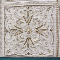
Julie Abbott’s Circles gives yet another interpretation of Japanese design. She uses the simple form of circles in well-ordered rows and let the fabric design take centre stage.
Moving away from the Japanese theme, a few others stood out for special mention:
Homage to Thoth
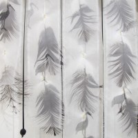
Madeleine Hedges’ Homage to Thoth is excellent both in design, choice of materials and execution. Thoth, the Egyptian god of wisdom is usually depicted as an ibis-headed creature which Madeleine interpreted by using Ibis feathers collected along the Torrens River, combined with ibis printed sheer fabric. Two things in this work stand out to me: The subtlety with which Madeleine manages to combine her Egyptian roots with her Adelaide life via the iconic Ibis, and the judges’ decision to place the work in the exact spot where the draft from the AC continuously stirs the ibis feathers ever so slightly. It adds an extra dimension to the work and brings it to life.
Was that intentional?
Prehistory – Women
Two works that touched me with the understated way in which the artists used limited colours and well thought out stitching, conveying a deeper story, are Alison Muir’s Carbon Sink 2, and Valerie Robinson’s Prehistory – Women. When you look at it, take your time and really study the way every stitch is intentional and every slight colour change has a deeper meaning. Both are exceptional works.
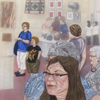
The Gallery Experience
Margaret Knapp’s The Gallery Experience is a true experience and needs to be studied in detail. She celebrated the graduating exhibition for students of 2012 Cert IV Visual and Arts Course at Marden. Her work is built up with three layers consisting of a traditional quilted foundation layer and two layers of appliqued clear organza. The space between the layers adds to the feeling of the depth of the gallery and the movement of the visitors. The ‘art in the gallery becoming art in the gallery’ concept is intriguing and well executed. She deservedly received the Encouragement Award sponsored by Sue’s Sewing World.
Doorway
Joy Harvey’s Doorway is a striking piece of highly detailed contemporary reverse applique – a technique Joy has perfected and made her own. Based upon one of the countless doorways of the Alhambra in Spain, Joy reworked the design to ‘bring it home’ and make it her own. By incorporating elements of local architecture and heritage, like inserting the inscription ‘Ut Prosint Omnibus Conjuncti’ (United for the common good) from the Adelaide coat of arms, Joy succeeded in creating something truly local, yet ultimately exotic, like only she can.
There are 44 works in the exhibition. Each one is deserving and worth exploring. The well thought out way in which Suzanne and Julie curated the exhibition, placing each work in a way that fully expresses its artistic merits, is exceptional and worth mentioning.
Don’t miss Dare to Differ 2015. Go and see it. But take your time – the more you look the more you see. The quilts on show are definitely different, and truly daring.
*Featured image: Circles by Julie Abbott
Did you enjoy this post? Share the joy: