The Marriage Bed

This is the story of my entry into Dare to Differ 2015.

THE MARRIAGE BED
My kombers en jou matras en …*
(My blanket and your mattress and …)
*Part lyrics from an old Afrikaans folk song
When we got married, most of our furniture were hand-me-downs from our respective childhood homes. Our bed, however, was brand new. The first piece of furniture we bought as a couple – a symbol of two lives becoming one and a place where we could dream and plan a future together.
The bed served us well for 15 years and even came with us when we moved to different countries. It was our refuge where we escaped the world, where we felt saved and loved, and the cradle where our family was conceived and cared for.
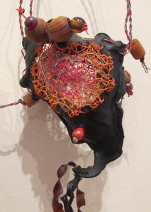
When it was time to replace the bed, I saved the frame and started working on the blanket, using yarn from my stash collected over the years from different parts of the world. They all represent a time and a place where we shared our lives. The blanket and the mattress are made separately and then stitched together in such a way that it cannot be separated again without destroying the whole thing.
THE MARRIAGE BED represents our marriage. Two separate entities becoming one. Each one with different characteristics and different values, which when put together cannot be taken apart again. The one provides strength and support, the other provides warmth and safety. Together they create a home and a family.
The lyrics come from our childhood, they don’t define us, but they anchor us. They make us belong.
As with any marriage, this one is not perfect. Dropped stitches, tension variations, messy colour changes, wires poking through in odd places, and loose ends – mostly hidden out of sight but still there. Looking closely you will see many flaws, but standing back, you will see a harmony of colour, the words will become clear and make sense, the structure will be strong and organised, and the threads will hold it all together.
****************
knitted strips

knitted strips

This project started way back in 2011. At that stage, we were living in Dubai and had just bought a new bed. I had a vague idea of what I wanted to make, or rather what I wanted to say, but had no fixed plan of how to go about it. I knew it had to involve the mattress frame and a knitted blanket. The snippet of lyrics served as the inspiration.

The plan I came up with eventually meant I had to knit the blanket in strips, weave it through the mattress springs and then stitch it together through the wire afterwards. It was the only way to get the knitting inside the steel springs. It took a bit of trial and error to get the right dimensions for the blocks and strips, which I then used to draw up a pattern and eventually a graph for each letter.

The Marriage Bed patternThe blocks are 16 stitches wide by 80 rows long. Five blocks in a strip, times 24 strips. I started out with the blank strips at the side, using different stitch patterns, but I soon realised that it won’t work once I start the intarsia knitting for the letters, so I kept most blocks in plain stitch.

I used the yarn that I had, adding as I needed or ran out of colours. The plan was not to plan. My only guide was that the whole letter, which spans three blocks, had to be in the same colour and to not have two similar colours next to each other. I used different thicknesses of yarn but the same needles throughout, which means the tension differs, but I think that is quite appropriate for a marriage!

AssemblingI knitted over time with periods in between when I didn’t do anything. My dear husband patiently allowed me to have the mattress frame packed and shipped with the rest of our household when we moved to Australia in 2012. I have no idea what the packers thought when they had to wrap it up in bubble wrap and load it into the container to ship across the Indian Ocean…

The knitting was coming along well but was still separate from the mattress when earlier this year I decided to force a deadline on myself, just to get it done. My mind wouldn’t allow me to start anything else before this one was out of my system, so I decided to submit it for the Dare to Differ exhibition. Now I had something to work for, and even if it wasn’t chosen it would still be finished.

Behind the scenes

Behind the scenes

Putting the knitting and the wire frame together took less time than I thought. It was a bit tricky at times to get my hand in between the wires and I had several scratches on my hands and wrists by the time I was done.

My husband made the stand which I think came out really good and goes well with the rest of the work. I like the big bold wooden bases and the fact that the steel supports are almost invisible.

So there we are – a marriage bed with a story.

What will I do next?

Dare to Differ 2015

From the point where you enter the gallery, it is clear that this is not your average quilt show. If you were expecting log cabins and pin-wheels you are in the wrong place.

According to Suzanne Gummow, one of the judges and organisers of the exhibition, for the purpose of this show, the definition of a quilt is that it must be predominantly fibre, be composed of at least two distinct layers, and be stitched together throughout.

That sounds simple enough until you look around and see in how many diverse ways this has been interpreted.

D2D 2015 Samantha Pope CBD

CBD Pojagi

Samantha Pope’s CBD Pojagi is the star of the show. On first glance, it is obviously a map of Adelaide CBD, with familiar landmarks like Victoria Square and the green belt easily identifiable. True to the purpose of a map, it is the first thing you look at when entering as if trying to find your way around. But also true to the purpose of a map, its sheer fabric lets you see what is beyond – opening the way towards the rest of the exhibition. The fusion of what is familiar (Adelaide) with what is foreign (pojagi) embodies not only the spirit of our city but also the spirit of the exhibition – the familiarity of quilts with the unfamiliarity of the Dare to Differ interpretations.

D2D 2015 Wendy Thiel Art in the Negative Space

Art in the Negative Space

Following the layout of the room, the first work you will come across is fellow judge and organiser, Julie Haddrick’s Garden path. Her use of Japanese fabric is the start of a subtle theme which recurs three more times.

Wendy Thiel’s Art in the Negative Space is one of the larger works and one of the few which reminds of a traditional quilt. Her use of white as negative space emphasising the art of the printed Japanese fabric, as well as her choice of quilt design inside the white areas, are very effective.

D2D 2015 Betty Morse My Chiku Chiku

My Chiku Chiku

Staying with the Japanese theme, Betty Morse’s My Chiku Chiku creates quite the opposite effect. Filled to the borders with printed fabric, it dares the eyes to become overwhelmed, but the order and stillness of the sashiko stitching are calming on the eyes and restores order. Her work is inspired by renowned sashiko artist Akiko Ike.

Julie Abbott’s Circles gives yet another interpretation of Japanese design. She uses the simple form of circles in well-ordered rows and let the fabric design take centre stage.

Moving away from the Japanese theme, a few others stood out for special mention:

D2D 2015 Madelaine Hedges Homage to Thoth

Homage to Thoth

Madeleine HedgesHomage to Thoth is excellent both in design, choice of materials and execution. Thoth, the Egyptian god of wisdom is usually depicted as an ibis-headed creature which Madeleine interpreted by using Ibis feathers collected along the Torrens River, combined with ibis printed sheer fabric. Two things in this work stand out to me: The subtlety with which Madeleine manages to combine her Egyptian roots with her Adelaide life via the iconic Ibis, and the judges’ decision to place the work in the exact spot where the draft from the AC continuously stirs the ibis feathers ever so slightly. It adds an extra dimension to the work and brings it to life.

Was that intentional?

D2D 2015 Valerie Robinson Prehistory  Women

Prehistory – Women

Two works that touched me with the understated way in which the artists used limited colours and well thought out stitching, conveying a deeper story, are Alison Muir’s Carbon Sink 2, and Valerie Robinson’s Prehistory – Women. When you look at it, take your time and really study the way every stitch is intentional and every slight colour change has a deeper meaning. Both are exceptional works.

D2D 2015 Margaret Knapp The gallery experience

The Gallery Experience

Margaret Knapp’s The Gallery Experience is a true experience and needs to be studied in detail. She celebrated the graduating exhibition for students of 2012 Cert IV Visual and Arts Course at Marden. Her work is built up with three layers consisting of a traditional quilted foundation layer and two layers of appliqued clear organza. The space between the layers adds to the feeling of the depth of the gallery and the movement of the visitors. The ‘art in the gallery becoming art in the gallery’ concept is intriguing and well executed. She deservedly received the Encouragement Award sponsored by Sue’s Sewing World.

D2D 2015 Joy Harvey Doorway

Doorway

Joy Harvey’s Doorway is a striking piece of highly detailed contemporary reverse applique – a technique Joy has perfected and made her own. Based upon one of the countless doorways of the Alhambra in Spain, Joy reworked the design to ‘bring it home’ and make it her own. By incorporating elements of local architecture and heritage, like inserting the inscription ‘Ut Prosint Omnibus Conjuncti’ (United for the common good) from the Adelaide coat of arms, Joy succeeded in creating something truly local, yet ultimately exotic, like only she can.

There are 44 works in the exhibition. Each one is deserving and worth exploring. The well thought out way in which Suzanne and Julie curated the exhibition, placing each work in a way that fully expresses its artistic merits, is exceptional and worth mentioning.

Don’t miss Dare to Differ 2015. Go and see it. But take your time – the more you look the more you see. The quilts on show are definitely different, and truly daring.

*Featured image: Circles by Julie Abbott

Dijanne Cevaal – Sentinelles

Sentinelles is a concept inspired by Dijanne’s spiritual connection to the land. The colours of the hand-dyed fabric reflect the colours of the Australian landscape while the hominid form gives homage to her European heritage. The haloed female form appears across religions and cultures to depict a sense of reverence, holiness and spirituality. Dijanne chose the word Sentinelles, which means to watch over, as opposed to Guardians, which also implies taking care. Sentinelles only observes. It is for us to act. To take care of the environment, the land, the earth.

What started out as a solo artwork has grown into a collaboration. Dijanne made several hand-printed Sentinelles and made them available to her students both in Europe and Australia to embellish. Each person brought their own personality and style to their piece.

The collection has travelled extensively in France and Australia and will soon go back to Europe for a new round of exhibitions. We were fortunate enough to experience this collection at the Craft and Quilt Fair this past weekend.

With Dijanne’s permission, I took a few close-up photos to focus on the magnificent use of colour and personal interpretation represented in this exhibition.

Go forth and be inspired.

Sentinelle 1 Sentinelle 2 Sentinelle 3 Sentinelle 4 Sentinelle 5 Sentinelle 6 Sentinelle 7 Sentinelle 8 Sentinelle 9 Sentinelle 10 Sentinelle 11 Sentinelle 12 Sentinelle 13 Sentinelle 14 Sentinelle 15 Sentinelle 16 Sentinelle 18 Sentinelle 19 Sentinelle 20 Sentinelle 21 Sentinelle 22 Sentinelle 24Read more about Dijanne’s work, her future projects and her new book here.


PRUDENCE MAPSTONE: TOTEMS

027Prudence Mapstone needs no introduction. She is the queen of freeform knitting, crochet, and yarn manipulation. Her colourful, vibrant and fun work always draws a crowd – and admiring sighs and smiles. Her totem exhibition at this year’s Fair is no exception. The totems, displayed in a small alcove next to her yarn stand, cannot be missed – just follow the crowd.

021Totems represent a kinship group – a clan, family or tribe – where some totems celebrate cultural or religious beliefs while others are merely decorative and an artistic expression of a shared experience. Prudence’s totems fall into this latter group. She celebrates yarn. It is as simple as that.

022The colours, textures and thickness of the different yarns dictate how she applies them. “It is an organic process. “I start by choosing a colour palette and it just grows from there.” Prudence makes a swirl, or a scrumble as she calls it, adds new colours, change the stitch patterns and builds on it until she, well… stops. When she has a few of these, she lays them out on a flat surface, plays around with it, then she fills the gaps with more knitting or crochet stitches. And so the totem grows until the scrumble clan is complete.

029Sometimes there are recurring themes, like the mitred knitting, or the bullion flowers, or the felted balls, but other times many different styles and stitch patterns sit comfortably next to each other like different personalities in one big happy family.

Prudence is as delightful as her work, she smiles, talks and shares. It is obvious that she loves people, yarn, and yarn-loving people in equal measures.

To see her work and find out about her classes, books and patterns visit her website at http://www.knotjustknitting.com

Margaret Lee – Silk Legacy

Margaret at work

Margaret at work

Margaret Lee is a familiar name in embroidery circles both here in Adelaide and further afield. Her magnificent exhibition Silk Legacy – A showcase of Chinese Embroidery Tradition is on in the Artspace Gallery at the Adelaide Festival Centre, as part of the OzAsia Festival, until 12 October 2014.

As an artist, teacher and curator Margaret specialises in the ancient art form of Su silk embroidery, which dates back from the Shang Dynasty (1700 – 1027BC). It is known for its detailed, intricate and highly realistic style, and perfectly suitable for contemporary applications.

silk-CranesThe exhibition includes Margaret’s own work, some glorious historical pieces on loan from various Guilds and private collections, as well as works by Margaret’s students, both local and international.

“In China embroidery has always been viewed as an art form as opposed to craft and has left us with a legacy that is as relevant today as it was thousands of years ago. Such a long and rich tradition deserves to be maintained and further developed into the future.” Margaret’s passion lies in preserving the tradition and she is committed to passing this knowledge and skills on. In doing so she developed a program to teach Chinese embroidery to western embroiderers and is currently mentoring students from Australia, New Zealand, France, United Kingdom, USA and the Netherlands. SILK LEGACY is an opportunity to showcase their achievements. “These art embroideries created by western embroiderers in the traditional way shows that art has no boundaries and we are one through our shared passion for creating beautiful art embroideries.”

A close-up of a still life by Margaret Lee. Look at the exquisite stitch quality on the glass ware

A close-up of a still life by Margaret Lee. Look at the exquisite stitch quality on the glassware

Looking at all the extraordinary works in the exhibition, it is difficult to believe that some of these works were created by people who did not grow up in this tradition. The collection of student’s works sits proudly next to the ancient artefacts and Margaret’s own extensive body of work.

The explaining text next to each artwork gives a thorough background of where each piece fits into the hierarchy of silk embroidery skills. Apart from the absolute visual feast, the show gives a thorough education in the understanding of silk embroidery and where it fits into the social structure of both Chinese history and modern needle art appreciation.

I took some photos with Margaret’s permission, but it is very difficult to convey the depth of skill, the exquisite use of colour and fine stitch management in each piece. It is best viewed close up and in person.

This is a must see exhibition. Don’t miss it.

Marden Senior College – Visual Arts: Textile

Trisha's batikThe little pieces of batik fabric Trisha carefully lays out on the table is as colourful and exotic as the tattoo on her wrist. Orange and green overlaid with yellow and blue. “When I started here in February, I only worked with black, purple and red.” Trisha’s affection for all things goth is evident in her black clothing, tattoos and piercings. “Adding green, blue and orange is a big step for me,” she says.

She is one of textile students in the Certificate III in Visual Arts course at Marden Senior College. On the day I visited they were working on crazy-patch and Kantha embroidery. It forms part of the unit on embellishments.

studioThe studio is warm and welcoming. Sunlight streams in through a wall of windows on one side, while the opposite wall is covered with a colourful collage of projects, photos and inspirational pictures. Two long tables in the centre of the room are filled with students’ work in progress, piles of fabric, thread and other stashes while the end table is piled high with samples of Kantha and crazy patchwork.

009Suzanne Gummow, head of the textile course and lecturer, talks about the history, background and cultural context of each technique before giving links and references for further study and research. Students are expected to do a lot of self-study and exploration of each module of work. The emphasis is on doing, making and experiencing, backed up by thorough research and extensive theory work.

005Maxine and Gaynor are both experienced quilters. They are familiar with working with textiles but felt traditional quilting was becoming too precise and restricting.  They longed for freedom and new challenges and were ready to broaden their horizons. And that is exactly what they’ve found in this course. “We are looking with new eyes at familiar things.” They tell me. No longer restricted by straight lines and even seams, they play like children, experimenting with uneven edges, daring colour combinations and many exciting kinds of fabrics.

004Suzanne obviously loves every minute of teaching and sharing information. An accomplished and awarded textile artist in her own right, Suzanne insists that she learns as much from her students as she teaches them. “The moment I stop learning, I will stop teaching.”

Students range in age from 16 to 73. Many students move on to become full-time textile artists, others move into fashion and costume design, but all agree that the Marden Textile course changed their lives and enriched their world.

002Janine assures me that although she could sew in her ‘previous life’, she never considered herself artistic. “This course opened my eyes and mind to look at the world differently. I am learning how to transfer the things I see and collect into a picture and an artwork. The things I make are no longer flat and lifeless, but they pop. They breathe.”

“We learn from each other” Trisha adds as she works on her batik piece. “We find inspirations from each other. The vibe and atmosphere in the studio are creative and stimulating. I never want to leave!”

003The course consists of a Cert III and Cert IV courses and can be done full time or part time. It involves practical work as well as theory. Although it is extremely stimulating and creative it is quite intensive and requires a big time commitment. This is not a hobby course but a full-on study course, but according to everybody involved, both student and teachers, worth every minute you devote to it.

To learn more about the course visit the Marden College website: http://www.msc.sa.edu.au/wp-content/uploads/2013/11/Textiles-3-4_MSC15.pdf

Visit Suzanne Gummow’s blog here: http://sgummow.blogspot.com.au/

SALA – Class Act Collective

Class Act Collective Serendipity 6August is SALA (South Australian Living Artists) month in Adelaide. I started on a high by visiting SERENDIPITY, the Class Act Collective exhibition at Stump Hill Gallery this past Sunday.

Class Act Collective is a group of thirteen textile artists based here in Adelaide. The group evolved after they all finished their Textile Art studies at Marden College. Together they explore the artistic possibilities of fibre, textiles and stitching.

Class Act Collective Serendipity 8


Natural dyes – the theme for this exhibition – is by definition unpredictable, exciting and surprising, hence the name of the show, Serendipity – A happy accident of fibre, dyes and stitch.

Stump Hill Gallery is the perfect venue for this exhibition. Surrounded by vineyards and open countryside, with a warm, natural and airy interior, it enhanced the natural theme of the artwork and validated the earthy hues of the fabrics and fibres.

Class Act Collective Serendipity 1I love that the description of each artwork explains the process the artist used to obtain the final result. The finished artwork is just a small part of the whole process and much of that is lost if you only see the end product. By explaining how cloth was boiled in onion skins, wrapped around trees and left exposed to the elements for days, tied around rusted iron objects, and dyed with eucalyptus leaves, it adds that extra dimension to the work.

Class Act Collective Serendipity 4But the work is so much more than dyed fabric. The composition of the final work, the story it tells and the technically superb stitching, elevates each and every item from craft to fine art.

Each of the thirteen artists brings their own voice and unique talent to the exhibition. Wearable art, vessels and wall art. It all adds dimension and personality to the exhibition.

Class Act Collective Serendipity 2Serendipity is on until 31 August at Stump Hill Gallery in McLaren Vale. It will be worth your while to visit. All items are on sale (except the two that I already bought…)

Fabric of Life – and love

004 When I walked into Mary Jose’s shop in Melbourne Street for the first time, I thought – so this is what heaven must look like. Fabrics and textiles from all over the world were hanging on the walls, draped over tables, and tucked into shelves. The colour was glorious, but the smell was even better. I reminded myself of what I always tell my children before we go into a shop: ‘This is a hands-behind-your-back-shop. Don’t touch.’ But alas – I couldn’t help myself – I had to touch everything. I stroked the suzani’s, I hugged the kanthas, I caressed the Indian embroideries. I loved Mary’s shop and couldn’t wait to meet her.

Since then I learned that Mary is not just a Fair Trade textile dealer, but also one of the leading textile conservationists in the country, with an impressive list of conservation projects from across the world to her name.

Mary Jose conservation projectAs an Art History student in Canberra, Mary soon realised textiles were her first love, so after graduating, she moved to the UK where she studied at the Textile Conservation Centre, then housed at the Hampton Court Palace. She spent several years at the Textile Conservation Studio where she also worked on the Hampton Court Tapestries. After returning to Adelaide she joined ArtLab Australia, working on conservation projects for different Australian and international museums and galleries. For the past five years, Mary has been an independent conservation consultant with clients across the globe. (The conservation of the banners in the St Peter’s Cathedral is one of her ongoing projects.)

Mary Jose textile collectionIt was a textile tour to China in 1990 that sparked Mary’s interest in ethnic embroideries and textiles, and paved the way for her business venture as a textile trader. She travels regularly to India and other Asian countries where she meets the artisans. Mary is a strong believer in ethical trading and she buys all her textiles from the original artists in their traditional environment, thereby ensuring authenticity and quality. By following Fair Trade principals she also ensures that her business supports community development, self-sufficiency and sustainability.

Mary has recently moved her shop online and her conservation studio to her home in North Adelaide. On the day I visited she was working on a vintage scarf which needed to be cleaned and mounted for a private client; a military jacket dating from World War I which needed some restoration, for a private collector; and a raised embroidery piece which needed professional cleaning, also for a private collector.

Mary Jose book collectionThe walls in her studio are lined with shelves – some filled with her glorious textile collection, some filled with her vast collection of textile and art books, and some filled with her growing range of handmade cards.

These cards are part of a new initiative she recently launched. Beautifully embroidered or printed textiles, designed and handmade by individual artists, are framed with cardstock and made into greeting cards. But it is more than a card; it is an artwork all in itself. Mary stocks several ranges from India and a vibrant range from Malawi. Every card she sells help support an artist and his/her family in an ethical and sustainable fashion.

Mary Jose handmade cardsMary’s house-studio-shop is indeed a little piece of heaven. Not just because of the sight and smell of glorious fabrics, but because of her love and devotion to the origin of these textiles – the history of the old textiles which she respectfully helps preserve, and the future of the ethnic textile traditions which she so lovingly supports. Her love for textiles reaches into the hearts of all she works with – artists, collectors and customers. Mary’s life is not a hands-behind-your-back life. It is a hug, embrace and touch life.

Visit Fabric of Life’s website here

Sylvia Piddington – A Lace Space

Sylvia at Hughes Gallery

What words come to mind when you think about lace? I bet it is not words like ‘basket’, ‘rope’, ‘branches’, ‘hair’ or ‘seaweed’. But that is exactly what you will see when you visit Sylvia’s exhibition at the Hughes Gallery in Fullarton – many different forms of plant material, combined with thread, yarn, recycled plastic and more.

Sylvia Piddington Seaweed and Telephone wireSylvia combines basketry and lace-making to create truly unique artworks that are robust and fragile at the same time. The contrast between delicate bobbin lace and earthy palm frond basket weaving is obvious, but somehow they draw each other in, feed off each other, enhance each other… maybe because both techniques are tactile, inviting touch and physical contact.

Sylvia Piddington Self PortraitBobbin lace is a very intricate form of weaving that is both exact and free form. I watched Sylvia work on a scarf and it is obvious that the pattern on which she works functions as a guide only. The ultimate design happens in her head and in her hands as she works.

The exhibition is on until 27 July 2014 and forms part of the OIDFA 16th World Lace Congress which is currently in progress in the city.

St Peter’s Cathedral – ecclesiastical embroidery


High altarSt Peter’s Anglican Cathedral stands proudly above the river Torrens, looking down on central Adelaide – an apt landmark for the City of Churches. Airlie Black, convenor of the Cathedral’s Needlework Guild and daughter of Thomas Thornton Reed, the sixth Bishop of Adelaide, took me on a tour of the Cathedral to learn more about their treasured collection of needlework. According to the church records the Guild of St Peter was formed in 1885. Among other things, their task was to take care of the altar linen and to make the choir robes. From 1879 to 1900 the Guild of St Paul, a group of expert needlewomen (most of them belonging to both groups) worked on the needlework items of the Cathedral. They made frontals, stoles, altar linen, cassocks, surplices, kneelers and more. Some of their handiwork is still in use today.

Admiring the Santa Ecclesia Banner

Admiring the Santa Ecclesia Banner

The Cathedral has an impressive collection of banners dating from 1895 to 1993. Some of the older ones, now too fragile for use, have been restored and stabilised and are on permanent display. The Santa Ecclesia Banner dating from 1902 was one of those on display this month. Although its richness and opulent silk embroidery are still obvious, it is in a state of disrepair and is currently awaiting restoration.

Santa Ecclesia Banner damage

Santa Ecclesia Banner damage


The Cathedral’s vestments are a sight to behold. Airlie opened drawer after drawer and door after door, revealing the most gorgeous sets of vestments – some old and some new; some with a great story and some who are still earning their story. One of my favourite sets is the Reed cope, mitre and hood. It was embroidered by the Sisters of Bethany in England in 1957 and presented to Bishop Reed by the students of the Anglican Schools in Adelaide. The cope is richly embroidered with a design depicting Australian plant, bird and animal life.

Reed cope with Australian themed embroidery

Reed cope with Australian themed embroidery

Airlie Black with the Noils Silk Mass set

Airlie Black with the Noils Silk Mass set

Another one of my favourites is the Noils Silk High Mass set with Aboriginal-style ornamental bands. It was designed by John and Ross Moriarty and made by Audrey Ball in 1987. According to Airlie, it is a favourite with the congregation too.

Altar of Lady Chapel. Lily themed kneelers visible in lower left corner

Altar of Lady Chapel. Lily themed kneelers visible in lower left corner

Throughout the cathedral, I saw many canvas-worked kneelers and cushions. Most of them have a terra cotta colour background to not compete with the equally beautiful floor mosaics. The set that appealed to me the most were the ones in the Lady Chapel, an intimate and serene space behind the high altar. These were designed by Kaye Lynas and made by the Cathedral Guild during 1986. They feature a lily – the symbol of Mary, mother of Jesus. This design is carved into the altar and is carried on through the linen and needlepoint in the chapel.

Ivory brocade silk frontal with velvet super frontal

Ivory brocade silk frontal with velvet super frontal


The most striking embroidered items in the Cathedral must be the altar frontals. On the day I visited the altar was covered with an ivory brocade silk frontal with a central ornately embroidered cross motif. It was topped with an equally ornate velvet super frontal. These items date from the Victorian era and had in recent years been restored by the Needlework Guild under the guidance of Mary Jose, an expert textile conservationist.

Guidons, colours, ensign and banners

Guidons, colours, ensign and banners

On the left-hand side of the main axis of the Cathedral, around the Christus Rex, below the William Pope window, is a fine display of twenty guidons, colours, ensign and banners. These have been laid up here by South Australian regiments and battalions for safe keeping in perpetuity. They are consecrated objects which were in times past looked upon by the members of their regiment as symbols of safe refuge. They represent a large slice of South Australia’s history as some date from pre-Federation days, some from World War I and some from World War II. They represent honour and sacrifice, and are grouped to show that loyalty to country is senior to loyalty to the regiment but central to that is the symbol of Ultimate Sacrifice.

It is the perfect place to end my tour of the Cathedral. I feel honoured to share in this rich history and tradition, and it makes me happy to know that history, religion and beauty can be brought together with fabric and thread.

With gratitude to Airlie Black who took the time to show me around and share her vast knowledge with me. Some of the information in this article was taken from St Peter’s Anglican Cathedral Adelaide Handbook 2008 and the Guidons, colours, ensign & banners pamphlet available from the Cathedral shop.